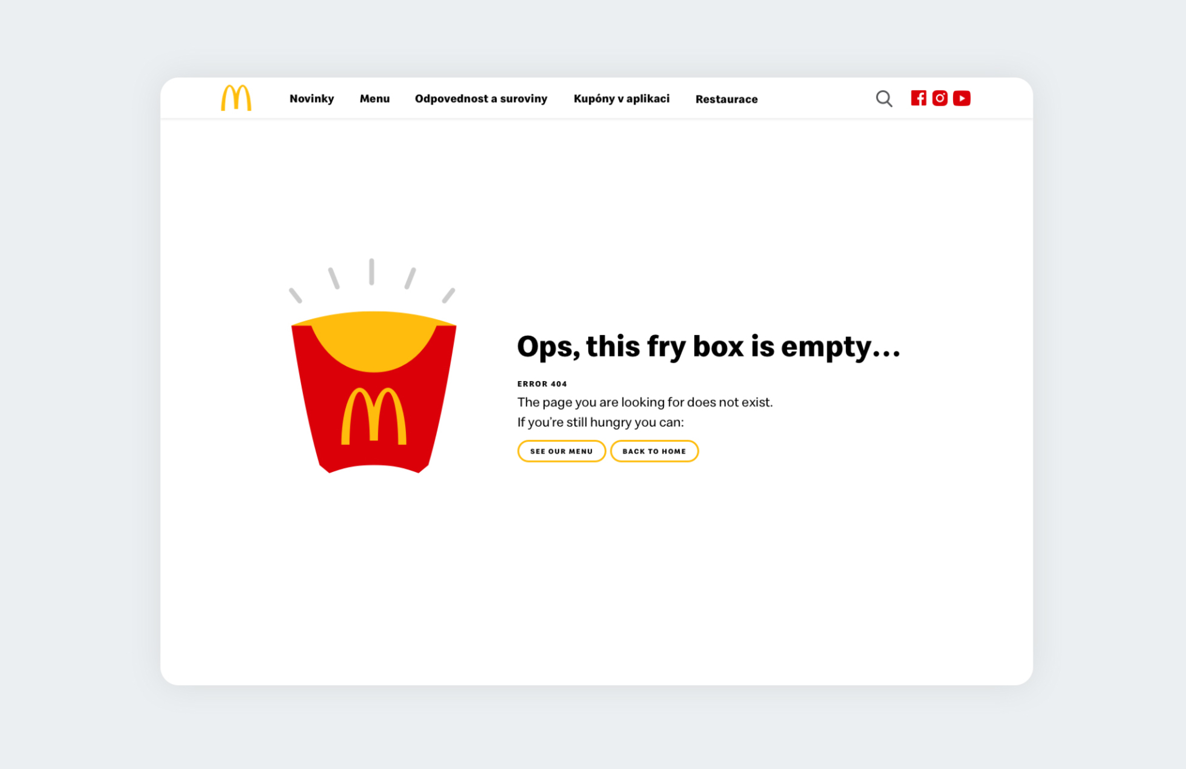
McDonald's website redesign
Rethinking user routes so they can easily find what they are looking for, and also a minimal + fresh look to go, please!
McDonald's
Czech Republic and SlovakiaAbout this project
My UX process on this project covered redesign the information architecture so users can find what they want more easily, wireframes, prototypes, ux writing, user testing and interviews, adjustments based on feedback, final interface, icons, and finally the UI animations.
The main goals of this redesign were to give a new and fresh look to McDonald's website by implementing the new brand identity recently launched, help users find what they want more quickly, provide more detailed information about the products and their nutritional values, and incorporating new McDelivery services on the new website.
Year
2019
My role
Inform. Arch
Wireframes
Prototypes
Ux writing
User Testing
Final UI
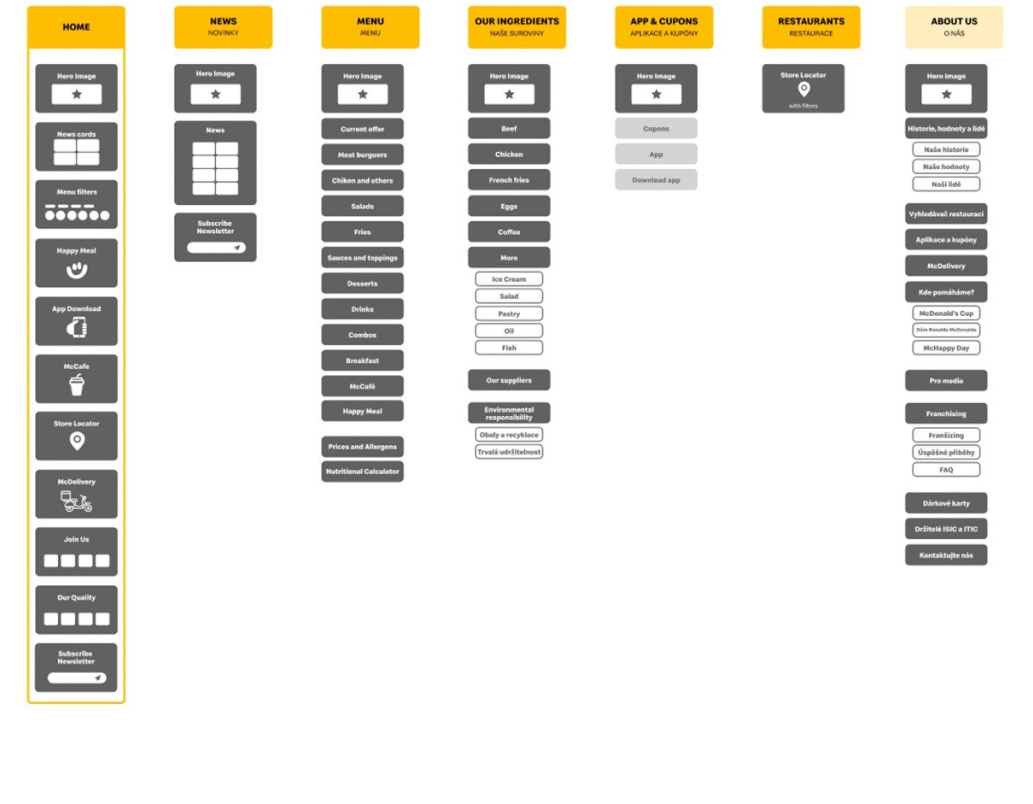
Starting with the Information Architecture
One of the first steps was to redesign the information architecture based on the main user needs and stories.
The main user routes were designed based on the user stories and contexts.
- Updated availability of the current McDonald's portfolio on the website.
- Locations of the closest restaurants with specific filters, like opening times, McCafé, Kids area available and others.
- Which toys can be found in the Happy Meals.
- Detailed ingredients of the menu items they sell.
- Calories and other nutritional values of our products.
-List of allergens
Creating wireframes and prototypes
After initial sketches, we created our first black and white wireframes in order to test our navigation and information architecture.
The Mobile version was a priority for us since 75% of access is from mobile devices.This stage was also important for sharing our work and get some feedback from the levels inside the company. Wireframes and prototypes were made of mobile and desktop versions before moving to the code stage.
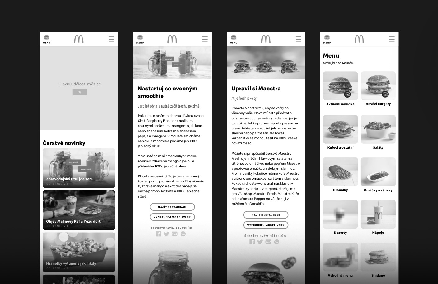
Minimal user interface
After defining basic structures and flow with our wireframes, we tested our prototypes with real clients covering different personas, since teenagers and young millennials, until users above 45 years old.
After the user testing, we could have important insights from users that helped us make some design decisions on the structure and layout of the pages.
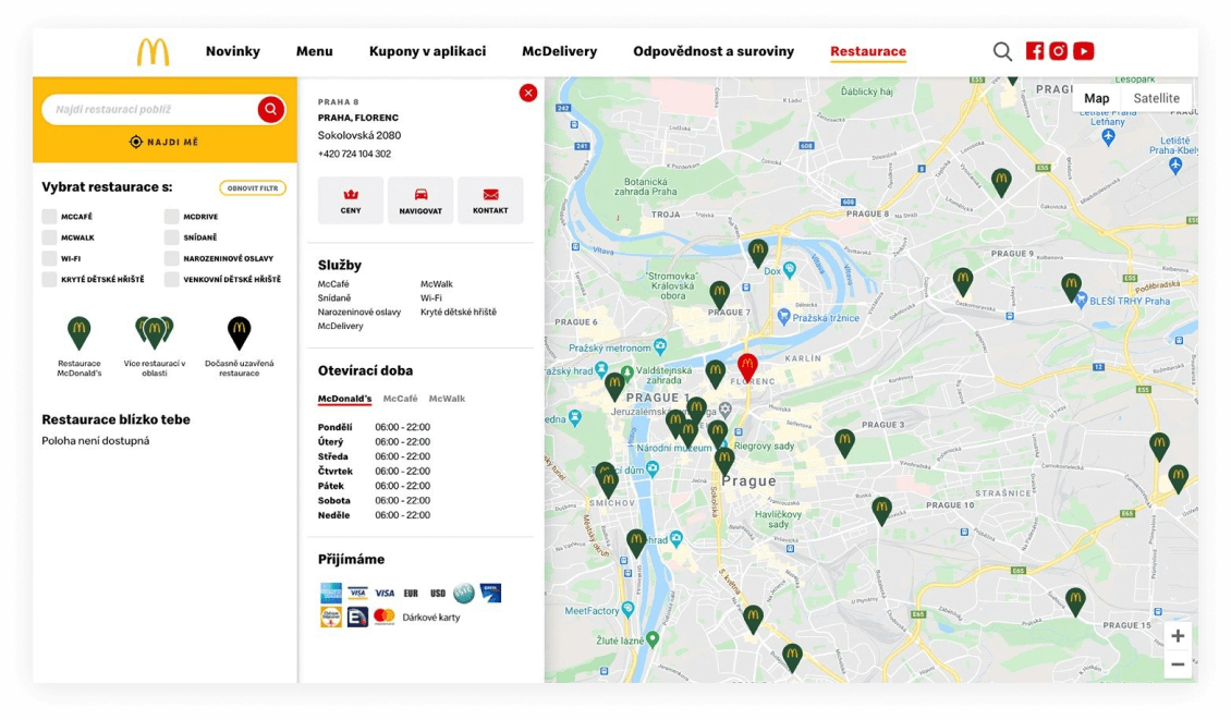
Rethinking the Store Locator
We made important changes on the store locator, this area have a high number of access from users.
In order to make users find what they need for specific stores, we added new filters based on user needs. Besides new filters, we created a more simple and minimal UI representing the new company's identity.
📍 Check it live.
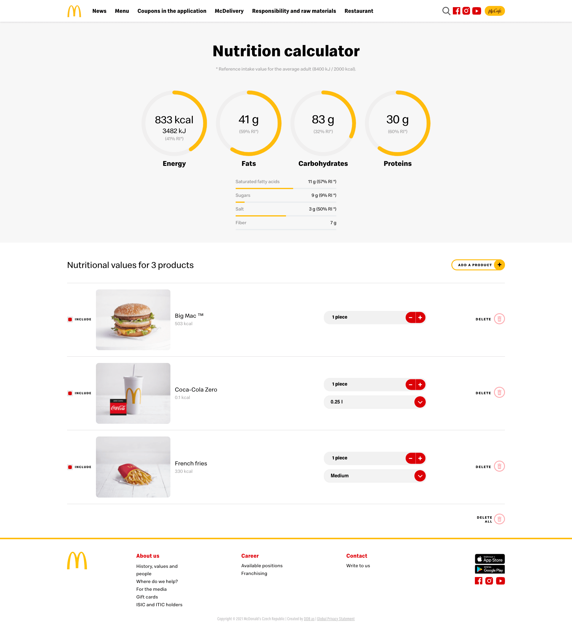
Control your diet with the Nutritional Calculator
Another important feature requested by users + clients was a detailed nutrition calculator
Understand what you eat
Here users can create a list and have relevant nutritional values from all McDonald's current portfolio of products.We also implemented a simple and minimal set of icons for allergens, another important piece of information for users and families with food restrictions.
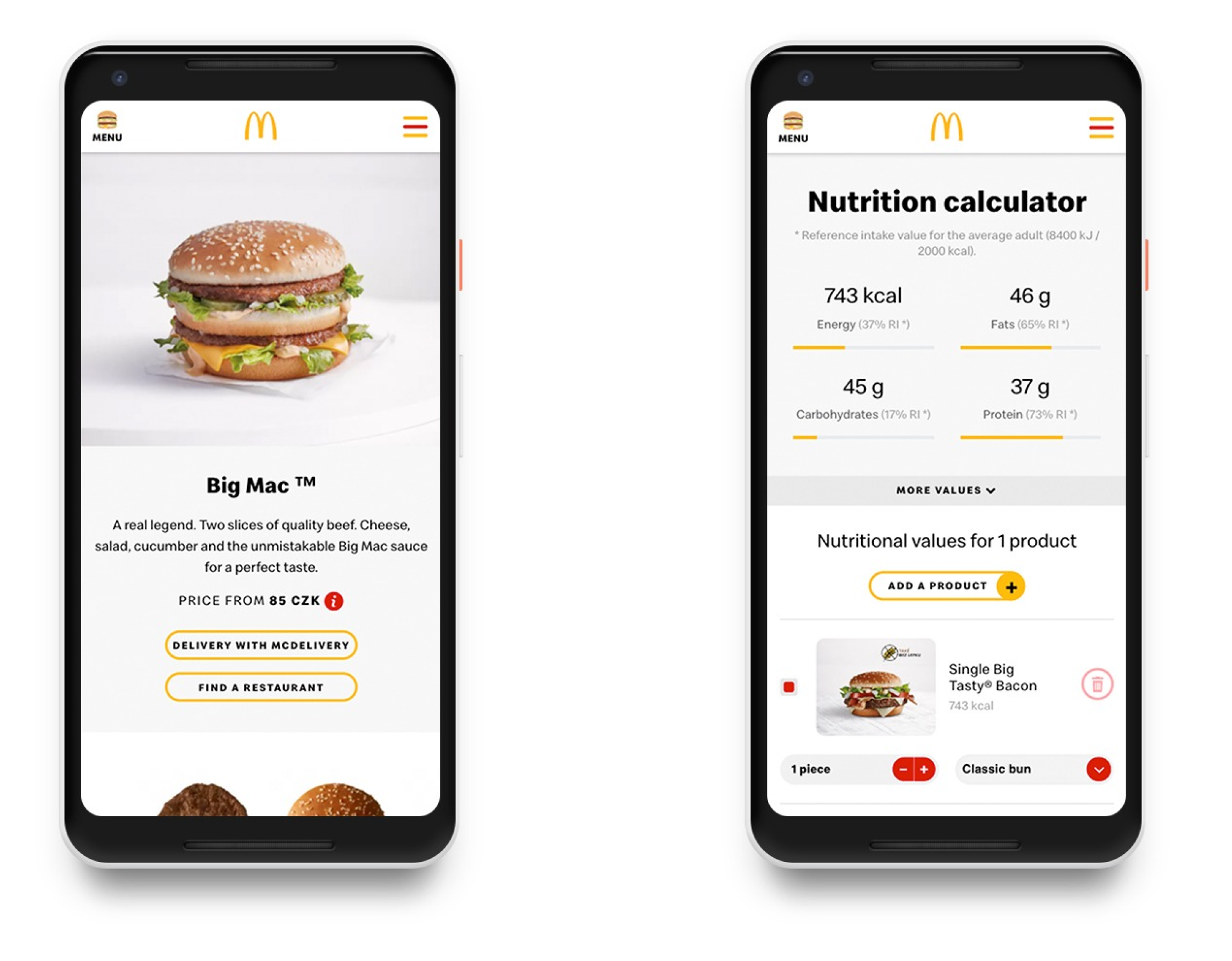
Mobile version
Organize all nutritional information inside such a small screen, plus making it comfortable for reading and functional was a great and joyful challenge.
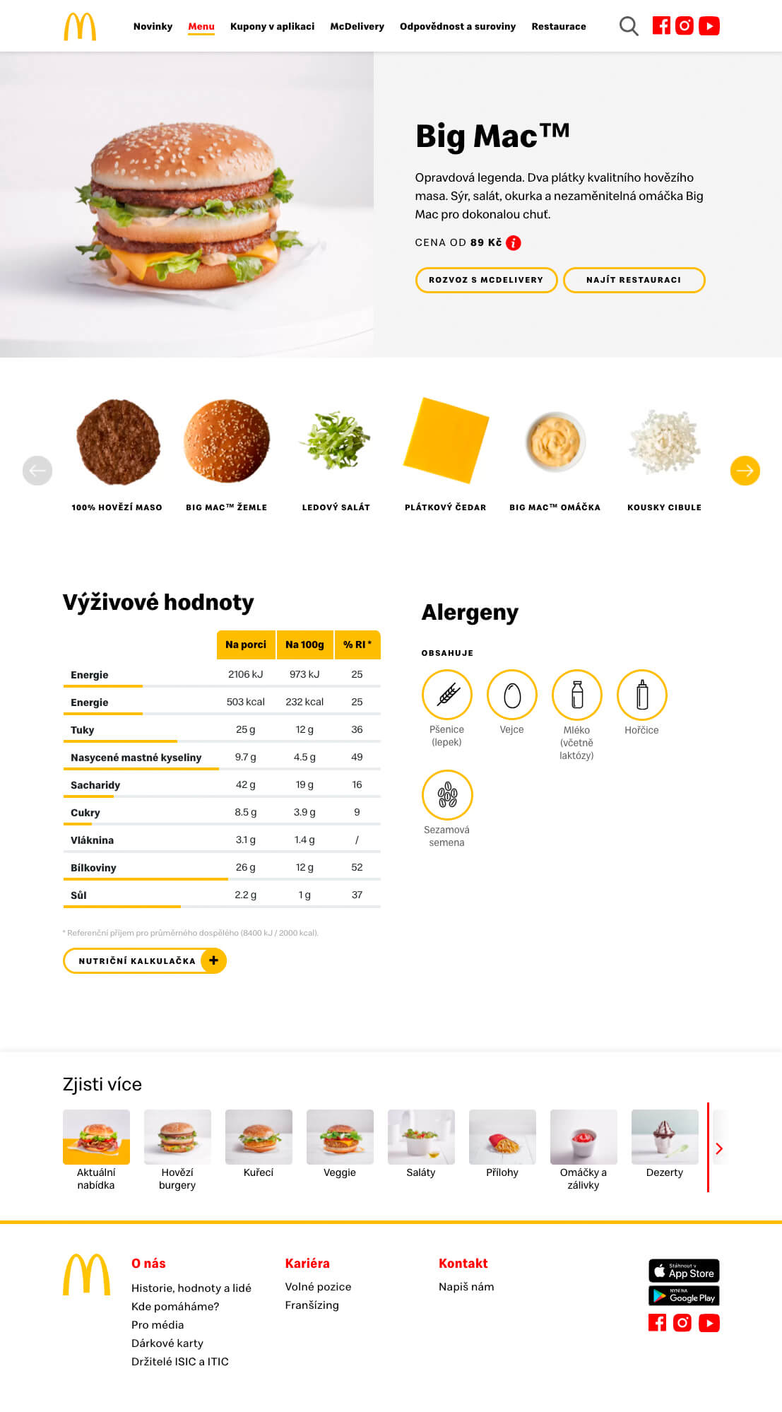
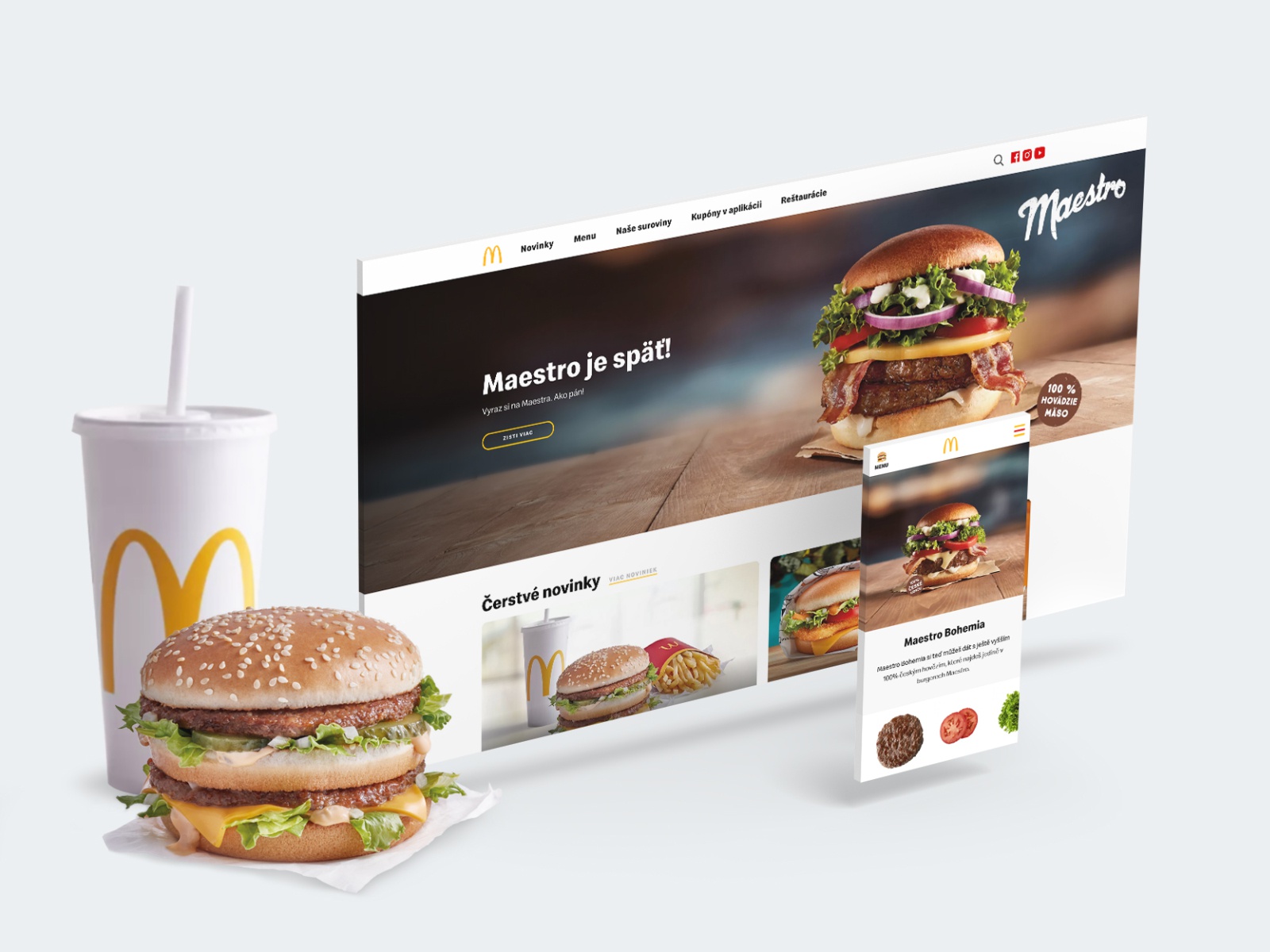
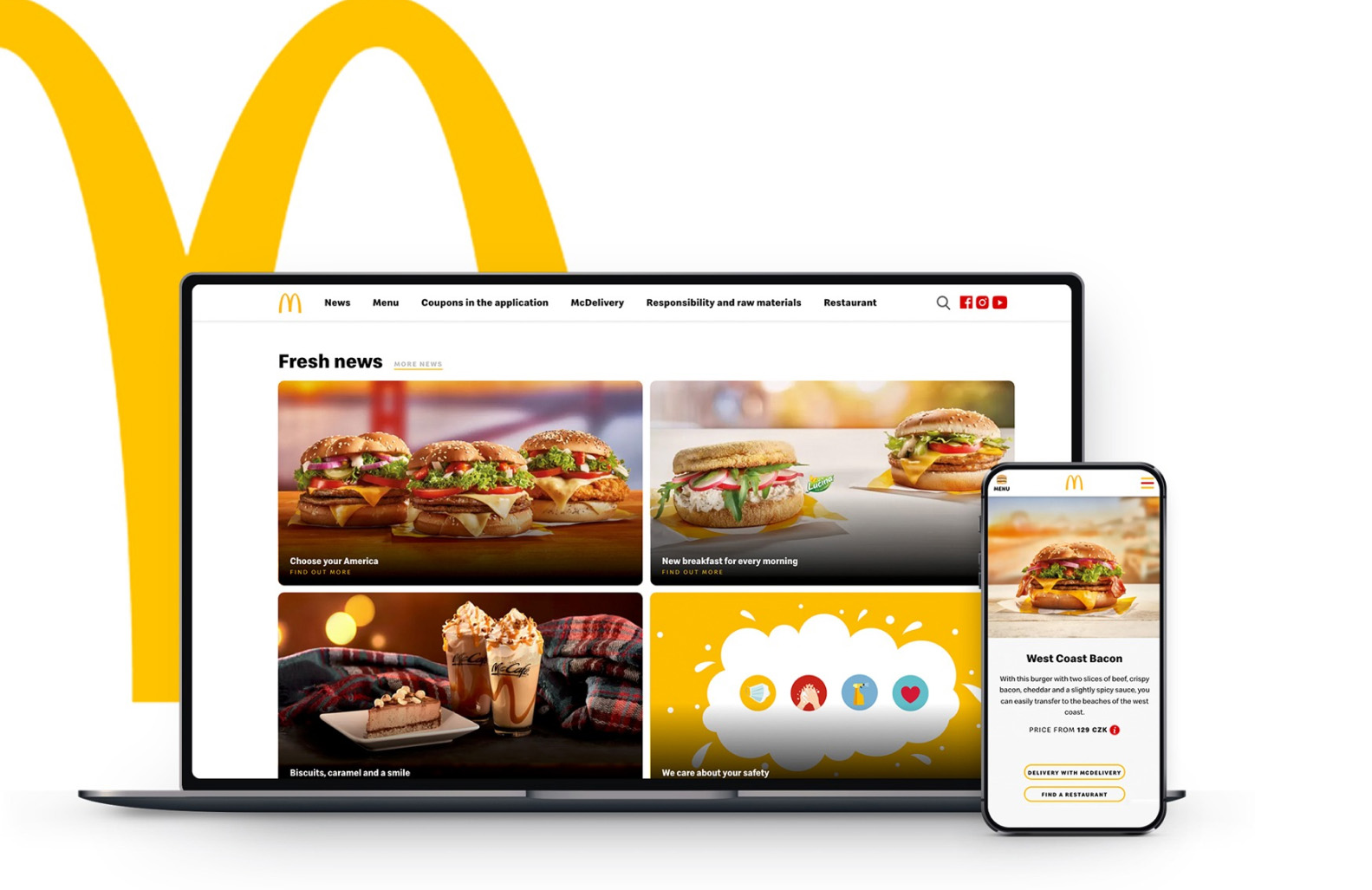
New product page
The main star of McDonald's website are, of course, the burguers! 🤩
Product pages were totally redesigned and improved. Some of the key improvements were:
• Adopt bigger images of the products in order to trigger hunger and appetite
• Slider with images of all ingredients of the product
• Price range (a big complaint from users was not having the price inside the page)
• Direct links to order via McDelivery
• Iconographic allergens table and more.
Key learlings
Prototype early
Focusing on having a functional as soon as possible helped guide our design decisions across the way
Test and test
When you involve people across different sectors you can better understand their pains and needs
Involve C levels on the process
The ability to test with a diverse audience helped us collect interesting findings and improve the design before we launch